20 / 12 / 03
CSS `grid-template-rows: masonry` 轻松实现原生瀑布流布局
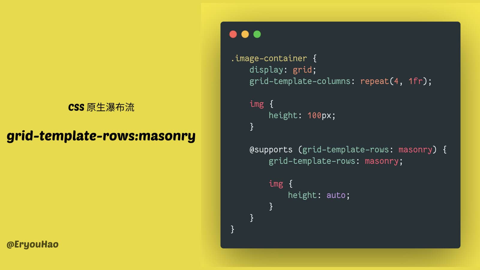
🌠 CSS 新属性 grid-template-rows: masonry 轻松实现瀑布流布局,CSS 越来越强大了!(目前在 FirefoxNightly 可用)
💡 小技巧:你可以用 @supports 来写面向未来的 CSS,当支持时以使用新特性实现更好的显示,不支持时也可以优雅降级。
实际效果,当不支持时,使用等高来进行图片显示。

图片的完整示例代码:
.unsplash-image-container {
  display: grid;
  grid-template-columns: repeat(4, 1fr);

  .unsplash-image {
    height: 100px;
    padding: 4px;
    cursor: pointer;
    img {
      object-fit: cover;
      width: 100%;
      height: 100%;
      border-radius: 6px;
      transition: transform 0.3s ease-in-out;
    }

    &:hover {
      img {
        transform: scale(1.03);
      }
    }
  }

  @supports (grid-template-rows: masonry) {
    grid-template-rows: masonry;
    .unsplash-image {
      height: auto;
    }
  }
}
延伸阅读
“如果你想有任何想法,欢迎在 X/Twitter 上联系我。”
Zayn HaoGridea & Minttr's Founder
Powered by Gridea